 Book Call with Haroon
Do your SaaS dashboards help your team make smarter decisions, or do they just look good on screen? At their best, SaaS dashboards surface your most important KPIs instantly. They take complex data and turn it into insights teams can actually use. At their worst, they become digital decorations, but are ignored.
The quality gap between dashboards is huge. The best dashboards make data easier to understand, faster to act on, and harder to ignore. They rely on interactive visualizations and focus only on metrics that matter. A strong SaaS metrics dashboard highlights key metrics such as Monthly Recurring Revenue (MRR), Customer Acquisition Cost (CAC), churn rate, and Customer Lifetime Value (CLV). These aren’t just numbers; they’re the foundation of B2B SaaS dashboards that drive real growth.
What is a SaaS Dashboard?
A SaaS dashboard is essentially the visual command center for your subscription business. It brings data from multiple sources into one centralized interface and presents it in a way that’s easy to scan, understand, and act on. Think of it like a health monitor for your SaaS company. Instead of digging through spreadsheets or disconnected reports, you get a clear snapshot of your company’s performance through the metrics that matter most.
Purpose of SaaS Dashboards
At their core, SaaS dashboards turn scattered subscription data into actionable business intelligence. Rather than forcing teams to interpret raw data, dashboards translate it into clear visual insights.
A well-built SaaS dashboard serves three key purposes:
- It transforms raw data into insights teams can act on
- It keeps performance metrics visible in real time
- It provides a single source of truth for decision-making
When dashboards are designed properly, they eliminate data silos across departments. Marketing, sales, product, and leadership all operate from the same numbers, which keeps teams aligned and focused on shared goals.
How Dashboards Support SaaS Growth?
SaaS growth depends on visibility. Dashboards make it obvious what’s working, what’s slowing you down, and where action is needed. Instead of relying on gut feelings, teams can make decisions backed by real performance data. Custom SaaS dashboards allow you to:
- Identify risks early before they turn into major problems
- Track progress against growth goals and KPIs
- Create accountability across teams with clear metrics
- Improve unit economics by understanding CAC, LTV, and churn
Dashboards also connect the dots between teams. For example, pairing sales data with customer success metrics can reveal how acquisition quality impacts retention and expansion.
Real-Time VS Static Reporting
| Aspect | Static Reporting | Real-Time SaaS Dashboards |
| Data freshness | Fixed, point-in-time snapshots | Continuously updated as events happen |
| Best used for | Historical analysis and past performance reviews | Day-to-day operations and live decision-making |
| Questions answered | “What happened last quarter?” | “What’s happening right now and what should we do next?” |
| Speed of insights | Slow, insights arrive after the fact | Instantly, insights appear as activity happens |
| Ability to spot trends | Limited and delayed | Early detection of trends and patterns |
| Anomaly detection | Often noticed too late | Catches anomalies in real time |
| Response time | Reactive | Proactive |
| Risk management | Issues surface after impact | Issues addressed before they escalate |
| Relevance over time | Quickly becomes outdated | Stays continuously relevant |
| Competitive advantage | Minimal | High, especially for SaaS companies operating at scale |
Key metrics every SaaS dashboard should track
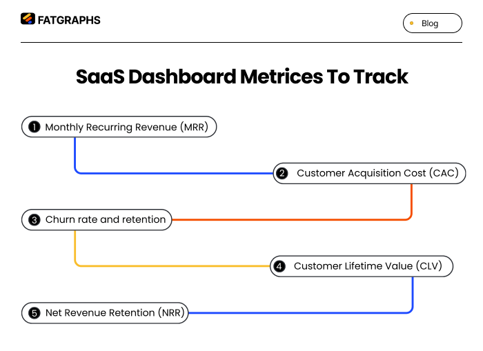
A SaaS dashboard is only as valuable as the metrics it shows. While it’s tempting to track everything, the most effective dashboards focus on a small set of core metrics that clearly reflect business health.
Monthly Recurring Revenue (MRR)
MRR represents the predictable revenue your SaaS business generates each month from active subscriptions. It’s the backbone of any subscription-based model.
Calculating MRR is straightforward: add up all monthly subscription revenue and convert annual contracts into their monthly equivalents. MRR helps you understand whether growth is coming from new customers, expansions, or reduced churn. When MRR is stable and growing, the business becomes far easier to forecast and manage.
Customer Acquisition Cost (CAC)
CAC shows how much it costs to acquire a single customer. It includes all sales and marketing expenses divided by the number of new customers gained in a given period.
For many SaaS companies targeting SMBs or mid-market customers, CAC typically ranges from $300 to $5,000. CAC becomes most meaningful when compared to CLV. A healthy SaaS business usually aims for a CLV-to-CAC ratio of at least 3:1. A high CAC doesn’t automatically mean failure; it often signals a longer payback period.
SOURCE: STRIPE
Churn rate and retention
Churn rate measures how many customers stop using your product over a specific period. Retention, on the other hand, shows how many stay. For small to mid-sized SaaS companies, average monthly churn usually falls between 3–7%, which translates to a monthly retention rate of roughly 93–97%. Churn is one of the clearest indicators of product-market fit. Rising churn often points to issues with onboarding, unclear value, weak activation, or poor customer support.
Customer Lifetime Value (CLV)
CLV estimates the total revenue you can expect from a customer throughout their relationship with your company. It’s calculated by multiplying average revenue per customer by gross margin and average customer lifespan. CLV helps balance growth decisions. A higher CLV allows you to invest more confidently in customer acquisition and expansion, while maintaining sustainable economics.
Net Revenue Retention (NRR)
NRR measures how much recurring revenue you retain from existing customers over time, including upgrades, downgrades, and churn. An NRR above 100% means your existing customers are generating net revenue growth on their own. Even a small increase in retention can dramatically increase long-term company value. High-performing SaaS companies with $15–30M ARR often maintain NRR above 105%, signaling strong customer satisfaction and expansion potential.
How to Create a SaaS Dashboard?
Building a SaaS dashboard that users actually rely on requires intention, not just design skills.
Define the goal
Start by clearly defining who the dashboard is for and what decisions it should support. Executives need high-level visibility, while operators need tactical, day-to-day insights.
User research, personas, and journey maps help identify what each audience truly needs. Ask questions like: What problem is this dashboard solving? And what action should this data drive?
Choose key metrics
Focus on 5–10 metrics that directly align with your goals. These should represent growth, engagement, and performance, not vanity metrics. A clean, focused dashboard is far more effective than one overloaded with every available data point.
Plan the layout
Information hierarchy matters. Place high-level metrics at the top and supporting details below. Group related metrics together and follow natural reading patterns like the F- or Z-pattern. Wireframing tools such as Figma or Sketch help validate layout decisions before development begins.
Use clear visuals
Every visualization should serve a purpose. Line charts work best for trends, bar charts for comparisons, pie charts for proportions (used sparingly), and scatter plots for identifying relationships. Clarity always beats decoration. Charts should be labeled clearly and easy to interpret at a glance.
Test and improve
Dashboards should evolve. Use usability testing, A/B experiments, and tools like Hotjar to understand how people interact with your dashboard. Continuous iteration ensures your dashboard stays relevant as business needs change.
Designing dashboards for each stage of the sales funnel
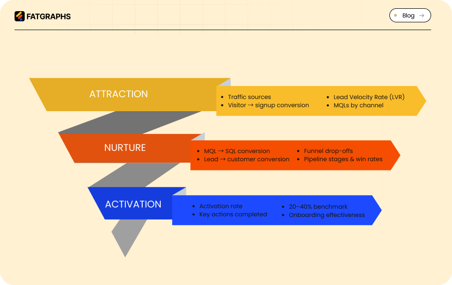
Different funnel stages require different insights. A single dashboard can’t serve every purpose equally well.
Attraction: traffic and lead generation metrics
At the top of the funnel, dashboards should track website traffic sources, visitor-to-signup conversion rates, and Lead Velocity Rate (LVR). Monitoring marketing-qualified leads (MQLs) by source helps teams identify the most effective acquisition channels.
Nurture: engagement and conversion tracking
Mid-funnel dashboards should focus on engagement and progression. Track MQL-to-SQL conversion rates, lead-to-customer conversion, session behavior, and funnel drop-offs. Sales teams benefit from pipeline dashboards that highlight opportunity stages, win rates, and deal velocity.
Activation
Activation is the moment users experience real value from your product. Dashboards here should track activation rates, the percentage of users who complete key actions after signup. High-performing product-led growth companies often see activation rates between 20–40%, which strongly correlate with retention and customer lifetime value. Cohort analysis helps identify which users succeed and where onboarding needs improvement.
Conclusion
Building great SaaS dashboards is both a strategic and design challenge. The best dashboards don’t just look good; they help teams understand performance, make faster decisions, and stay aligned. Effective dashboards start with clear goals and user needs. They focus on a small set of metrics that truly matter and evolve as the business grows. When designed around real workflows, dashboards become essential tools rather than passive reports.
The strongest SaaS teams treat dashboards as living systems. They refine them continuously, uncover deeper insights over time, and use them to turn data into a competitive advantage. Put users first. Focus on meaningful metrics. And build dashboards that help teams act, not just observe.
FAQs
Q1. What are the key metrics every SaaS dashboard should include?
The essential metrics for a SaaS dashboard include Monthly Recurring Revenue (MRR), Customer Acquisition Cost (CAC), Churn Rate, Customer Lifetime Value (CLV), and Net Revenue Retention (NRR). These metrics provide a comprehensive view of your SaaS company’s financial health and growth potential.
Q2. How can I design an effective SaaS dashboard?
To create an effective SaaS dashboard, start by defining clear goals and understanding user needs. Choose 5-10 key metrics that align with your objectives, plan an intuitive layout, use clear visualizations, and continuously test and improve based on user feedback and actual usage patterns.
Q3. What’s the difference between real-time and static reporting in SaaS dashboards?
Real-time dashboards continuously update as events occur, allowing for immediate insights and proactive decision-making. Static dashboards provide fixed, point-in-time snapshots, which are useful for historical analysis but can quickly become outdated in the fast-paced SaaS environment.
Q4. How should dashboards be tailored for different stages of the sales funnel?
Tailor dashboards to each stage of the sales funnel by focusing on relevant metrics. For attraction, track traffic sources and lead generation. During nurturing, monitor engagement and conversion rates. For activation, measure user completion of key first actions and activation rates by cohort.
Q5. Why is it important to limit the number of metrics on a SaaS dashboard?
Limiting the number of metrics on a SaaS dashboard to 5-10 core metrics helps maintain focus on the most critical aspects of your business. This approach prevents information overload, ensures clarity, and enables quick decision-making based on the most impactful data points.