 Book Call with Haroon
Most SaaS landing pages don’t have a traffic problem. They have a conversion problem. Bad landing pages hurt your business quickly. Visitors leave frustrated when pages load slowly, and they might never see what you’re offering. SaaS companies lose potential subscribers this way. You can fix this through proper landing page optimization. To cite an instance, A/B testing lets you compare different page versions to see what works best, which helps you make smart choices about your design and content.
This blog covers 6 ways to optimize your SaaS landing pages and create pages that convert well. These strategies will help you build landing pages that show your value clearly and bring in more conversions. Your pages will line up perfectly with what your business needs to achieve.
SaaS Landing Page Optimization: How to Increase Conversions Without More Traffic
A SaaS landing page succeeds when it has a crystal-clear purpose. Your homepage introduces visitors to your organization, but a landing page must zero in on one specific goal. Your design and content decisions take shape when you want to generate leads, promote a free trial, or boost sign-ups.
Define your main conversion action
Your landing page optimization starts with picking your main conversion action. This action becomes your North Star, the single metric that guides all your decisions. SaaS companies often use these conversion actions:
- Sign-ups or account creation
- Demo requests
- Free trial enrollments
- Resource downloads
Research shows that landing pages focused on a single, well-defined goal substantially increase their conversion potential. This clarity helps potential customers make decisions without feeling overwhelmed and creates a better user experience.
Match the landing page to your SaaS funnel stage
Visitors come to your landing page with varying levels of awareness and interest. They fall into distinct funnel stages that need different approaches:
1- Top of Funnel (Awareness Stage)
Visitors at this original stage sense a problem, but find it sort of hard to get their arms around it. They search for information to understand their challenges. Your landing page should educate rather than sell. Clear headlines without jargon, valuable content resources, and simple forms work best. Just ask for the first name and email. Soft CTAs like “Learn how it works” or “Download guide” work well here.
2- Middle of Funnel (Consideration Stage)
Visitors here compare solutions. They need specifics about your product use cases, proof, and walkthroughs. Your landing page should showcase benefits, testimonials, and a clear value proposition that sets you apart. “Start Free Trial” or “Book a Demo” work as ideal CTAs. Complex products with longer implementation times or higher prices often convert better with demo CTAs instead of free trials.
3- Bottom of Funnel (Decision Stage)
These visitors are almost ready to act. Your landing page needs pricing information, security badges, and detailed comparisons. Address objections directly and use bold, action-focused CTAs like “Subscribe Now” or “Schedule Your Demo”. Decision pages can run longer, but must stay focused on conversion.
Your landing page must match these funnel stages. Many companies push demos too early, which hurts conversion rates for early-stage and top-of-funnel traffic. Note that your landing page should earn the next step in the relationship rather than close the deal.
Best Practices to Optimize SaaS Landing Page
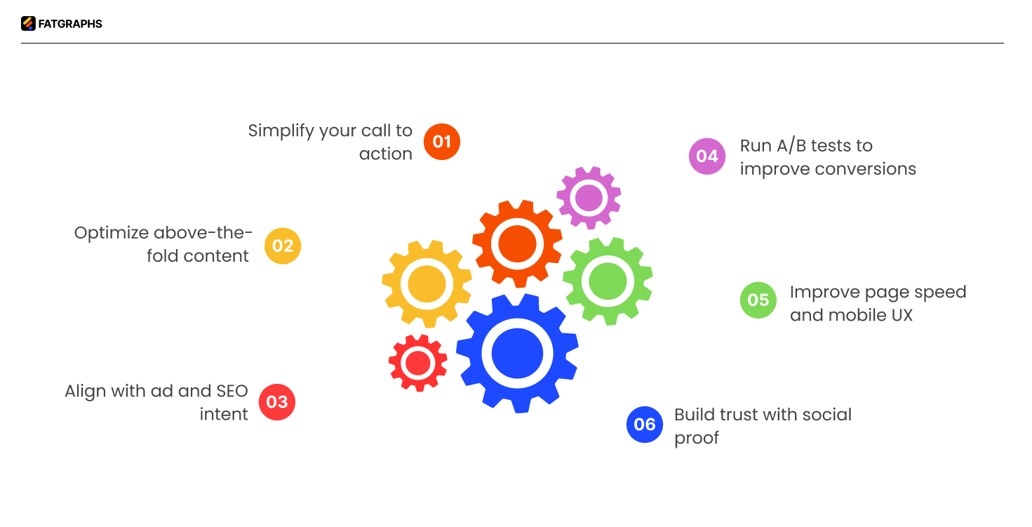
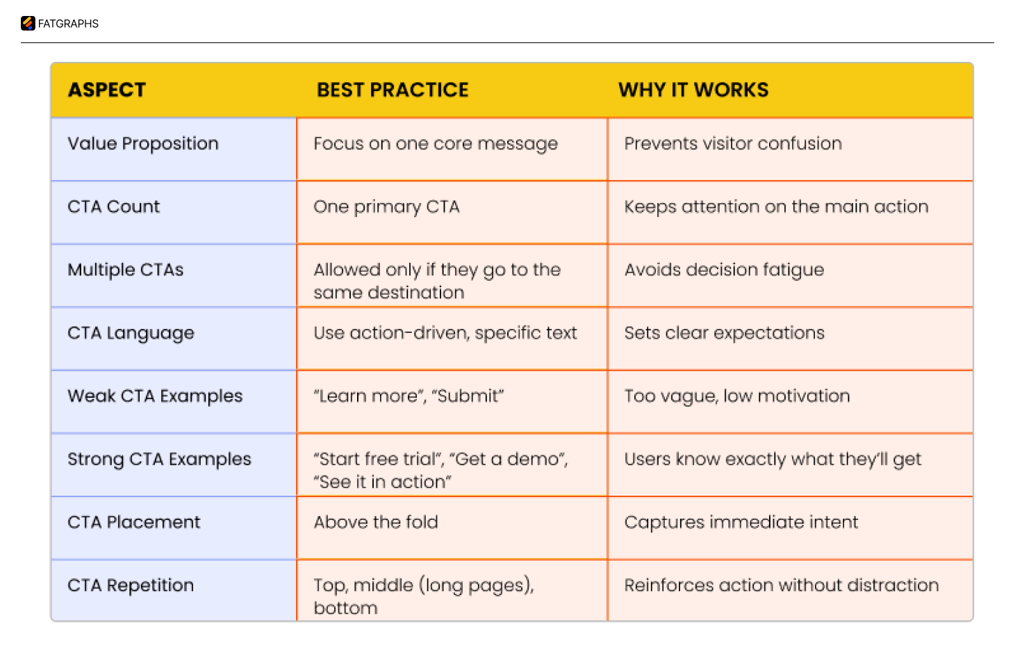
Best Practice 1: Simplify your call to action
The core of any successful SaaS landing page lies in your call to action (CTA). A simple yet vital element that affects your conversion rates and pushes visitors to take action. Data shows that CTAs with value-driven copy tailored to your audience work 202% better than generic ones.
Use action-driven language
Your CTA’s words shape how visitors respond. Basic text like “Click Here” or “Submit” doesn’t spark action. Action-oriented language tells visitors what happens next.
These tips work best:
- Clear verbs like “Start Free Trial,” “Get Quote,” or “Subscribe Now” drive more clicks
- Value-focused copy that shows specific outcomes and timelines
- Match CTA language to where buyers are in their decision process
- Write in first-person to build a personal connection
CTAs like “Get Started” and “Sign Up” perform best at converting SaaS prospects. On top of that, it builds trust to tell users what happens after clicking, whether it’s seeing prices, trial length, or credit card requirements.
Best Practice 2: Optimize above-the-fold content
Above-the-fold content shapes how visitors first see your SaaS product. Research shows visitors make up their minds about staying or leaving within seconds of landing on your page. This space plays a vital role in converting visitors.
Craft a clear, benefit-focused headline
Your headline makes the first connection with potential customers. It needs to tell them what your product does, who should use it, and how it helps – all at once. Most people judge your SaaS offering based on this element alone.
Strong SaaS headlines should:
- Focus on clear, tangible benefits rather than vague statements
- Speak directly to user pain points
- Use simple, direct language that avoids jargon
- Show what makes your product stand out
Research shows headlines that quickly explain your product’s unique value work better than creative ones.
Use supporting visuals or product screenshots
Text by itself rarely converts well. Visuals help break up text, boost user experience, and tell your story better. Your above-the-fold visual should bring your value proposition to life. SaaS products convert best with these visuals:
- Actual product screenshots showing key features
- Short demo videos (15-30 seconds, autoplay muted)
- Interactive product tour previews
These visuals should support your headline and subheadline without introducing unrelated features. Real screenshots or quick demo videos build trust faster than polished mockups that look artificial. Visitors connect better with your actual product than an idealized version.
Include a subheadline that reinforces value
Your subheadline adds significant clarity by expanding your headline’s promise. It should explain what you offer, who benefits, and the main advantage. Visitors can quickly see if your product fits their needs.
The best subheadlines:
- Add clarity to the headline promise
- Overcome the first potential objection
- Explain the main value proposition
Landing pages that focus on conversions might pair “Start Your Free 14-Day Trial” with “No credit card required. Full access to all features. Cancel anytime”.
People scan content instead of reading it deeply. A clear outcome-focused subhead line transforms “This product does XYZ” into “Here’s how your life gets better” by answering what buyers really want to know: “What’s in it for me?” The perfect above-the-fold content needs your headline, sub headline, and visuals to work together.
Best Practice 3: Align with ad and SEO intent
A connection between your ad message and landing page content creates a natural user experience that affects your conversion rates. This arrangement builds trust with potential customers, improves quality scores, and cuts acquisition costs.
Match landing page copy with Google Ads
Message match means keeping consistency between search intent, ad copy, and landing page content. Your paid campaigns work better when search intent matches your ad copy and landing page messaging perfectly. This boosts sign-up quality and reduces what you spend on acquiring customers.
Here’s a practical example: if your Google Ads target “social media aggregator,” but customers look for “Instagram aggregator” or “tweet aggregator,” you’ll see better results by creating unique landing pages for each term.
Use consistent keywords for SEO landing page optimization
The challenge lies in using keywords naturally without disrupting content quality. Your key phrases should appear in headlines, subheadings, body text, and calls to action. Search engines can then understand your page’s relevance better, which helps your ranking potential.
Take Salesforce as an example, they create dedicated pages for features customers search for, like “customer service integration” or “marketing automation”. This strategy helps your SaaS SEO and captures more leads.
Best Practice 4: Build trust with social proof
Trust signals on your SaaS landing page boost conversion rates and help you acquire more customers. Research shows that 90% of customers base their buying decisions on positive reviews. Social proof works because people naturally look for validation from others before making decisions. This becomes even more crucial for SaaS products where trust plays a vital role.
Add testimonials from SaaS users
Testimonials offer powerful validation from actual users who have nothing to gain from your product’s success. Their authentic endorsements really resonate with potential customers. The biggest advantage of SaaS testimonials lies in their ability to turn prospects into paying customers by showing unbiased social proof right away.
Here’s how to make testimonials work:
- Use video testimonials when possible, place testimonials on your landing page, right next to CTAs, feature testimonials that address specific pain points your target audience.
WikiJobs, a graduate jobs website, ran A/B tests and found that adding just three small testimonials to their product landing page increased purchases by 34%. This shows how even minimal social proof can significantly boost conversion rates.
Include logos of known clients
Client logos build instant credibility and trust. Big company logos tell visitors that your solution meets the standards of established businesses.
Here’s how to get the most from client logos:
- Display logos prominently at the top of your page to build trust early
- Group logos by industry if you target multiple sectors
- Place logos strategically before important CTAs to ease decision-making
- Combine logos with brief success stories to add context to the recognition
Use security badges or certifications
Security badges and industry certifications tackle key concerns about safety, compliance, and professional standards. These trust signals matter most for SaaS offerings that handle sensitive data or require substantial investment.
Your certification strategy should:
- Display security seals near sign-up forms or checkout buttons to reassure visitors about data protection
- Feature industry-specific certifications that matter to your target audience
- Showcase awards or recognitions that prove your solution’s quality and reliability
Only use genuine, verified badges and testimonials fake ones can destroy your brand’s credibility forever. Keep updating your social proof elements to showcase your latest and most impressive client relationships and achievements.
Best Practice 5: Improve page speed and mobile UX
Research reveals that 40% of people abandon websites when they take more than 3 seconds to load, which can seriously hurt your conversion rates. A single second of delay can drop conversions by 7%.
Compress images and scripts
Slow load times often stem from oversized or uncompressed images. You’ll get better compression with modern formats like WebP and AVIF compared to JPEG and PNG. Here’s how to optimize your images:
- Implement lazy loading to defer image loading until needed
- Match image sizes to their display dimensions
Use responsive design
A good mobile experience needs properly sized elements, clear navigation, and easy-to-tap CTAs. Starting with mobile design helps your landing page work perfectly on all devices. This approach favors clean layouts that work well on smaller screens and removes complex elements that might cause problems on mobile.
Test mobile performance regularly
Regular testing helps catch problems before they affect your conversions. Google PageSpeed Insights, Lighthouse, and GTmetrix will give you a full picture of your landing page performance. Make sure to test on different devices and network conditions. Google now looks at mobile speed first when ranking sites, putting it ahead of desktop performance.
Best Practice 6: Run A/B tests to improve conversions
A/B testing replaces guesswork with informed decisions to optimize your SaaS landing page. You can find what actually drives conversions by comparing different versions of your page elements.
Test one element at a time
Your testing results need accurate variable isolation. Changes to just one element per test, a headline, image, or form length will show you exactly what affects user behavior. This careful method prevents misleading results that happen when you test multiple elements at once.
These elements make the biggest impact:
- CTAs (button color, text, placement)
- Headlines and subheadlines
- Form fields (number, arrangement, design)
- Social proof elements
Single element tests help you identify what drives adoption in your target audience. Your conversion rate changes will truly reflect your modifications, not random group selection or outside factors.
Analyze results and iterate
Look past conversion rates to find valuable insights. Secondary metrics show collateral damage and put performance in context. Breaking down results shows which variations work best for specific groups. Some variations might lose overall but work great with certain segments.
Put winning variations to work quickly tests only add value when you use what you learn. This creates an ongoing improvement cycle that steadily boosts your landing page results.
Conclusion
These optimization practices work together to create pages that strike a chord with your target audience. Your implementation will lead to higher conversion rates, lower customer acquisition costs, and better marketing ROI. Take one practice at a time, measure results, and refine your approach based on analytical insights.
Landing page optimization continues to evolve with your business and customer needs. Successful SaaS companies understand this ongoing process and stay committed to improvement. Careful optimization turns your landing pages into powerful conversion tools that transform visitors into valuable, long-term customers.
FAQs
Q1. What are the key elements of an effective SaaS landing page?
An effective SaaS landing page should have a clear goal, a simplified call-to-action, optimized above-the-fold content, alignment with ad and SEO intent, social proof elements, fast loading speed, mobile responsiveness, and be continuously tested and improved.
Q2. How important is page speed for a SaaS landing page?
Page speed is crucial for SaaS landing pages. Research shows that 40% of people abandon websites that take more than 3 seconds to load, and a 1-second delay in page response can reduce conversions by 7%. Optimizing images, scripts, and implementing responsive design can significantly improve page speed and user experience.
Q3. How can A/B testing improve SaaS landing page performance?
A/B testing allows you to make data-driven decisions by comparing different versions of your landing page elements. By testing one element at a time, such as CTAs, headlines, or form fields, you can identify what truly drives conversions and continuously improve your landing page performance.
Q4. What is a good SaaS landing page conversion rate?
A typical SaaS landing page converts between 2% to 5%, while well-optimized pages can reach 8% to 12%+. High-intent pages (like demo or free trial) usually perform better than top-of-funnel pages. The benchmark depends on traffic quality, offer, and funnel stage.
Q5. How do you optimize a SaaS landing page for conversions?
Focus on a single goal, use a clear value-driven headline, and place a strong CTA above the fold. Align your messaging with user intent, reduce friction (fewer form fields, fast load speed), add social proof, and continuously run A/B tests to refine performance.
Q6. What should a SaaS landing page include?
A high-converting SaaS landing page should have a clear headline, supporting subheadline, strong CTA, product visuals or demo, social proof (testimonials/logos), benefit-focused copy, and trust elements like security badges. Everything should guide the user toward one specific action.